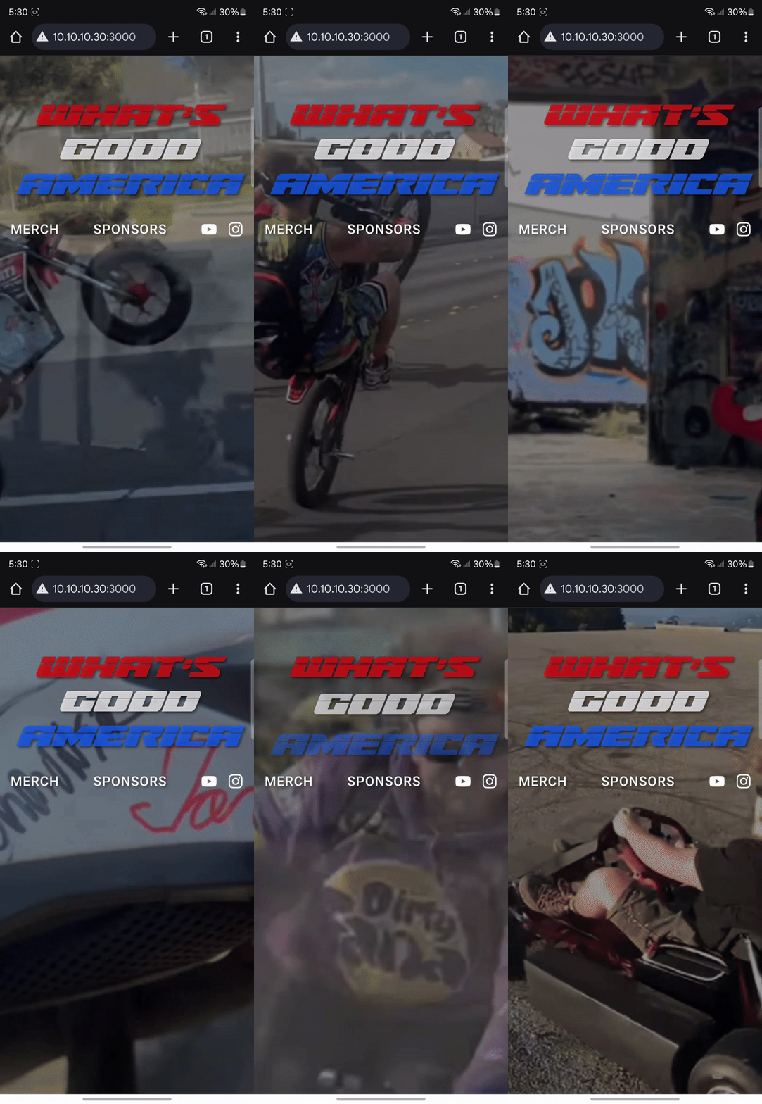
Cool UI Developments
Progress I made on the UI side of things
Established stack
Video-background layout
This is a modified component from a shadcn-compatible UI library called cult-ui. I changed it from the default to support proper z-indexing so I can build things over the media background, added more opacity, and just looped the video instead of having controls.
"use client";

import React, { useRef } from "react";
import { cva } from "class-variance-authority";

import { cn } from "@/lib/utils";

type OverlayVariant = "none" | "light" | "dark";
type MediaType = "image" | "video";

const backgroundVariants = cva("relative w-full overflow-hidden", {
  variants: {
    overlay: {
      none: "",
      light:
        "before:absolute before:inset-0 before:bg-white before:opacity-40 before:z-10",
      dark: "before:absolute before:inset-0 before:bg-black before:opacity-40 before:z-10",
    },
    type: {
      image: "",
      video: "",
    },
  },
  defaultVariants: {
    overlay: "none",
    type: "image",
  },
});

interface BackgroundMediaProps {
  variant?: OverlayVariant;
  type?: MediaType;
  src: string;
  alt?: string;
  className?: string;
  children?: React.ReactNode;
  height?: string;
}

export const BackgroundMedia: React.FC<BackgroundMediaProps> = ({
  variant = "light",
  type = "image",
  src,
  alt = "",
  className,
  children,
  height = "h-screen min-h-[500px] lg:min-h-[600px] max-h-[1000px]",
}) => {
  const mediaRef = useRef<HTMLVideoElement | null>(null);
  const mediaClasses = cn(
    backgroundVariants({ overlay: variant, type }),
    height,
    className,
  );

  const renderMedia = () => {
    if (type === "video") {
      return (
        <video
          ref={mediaRef}
          aria-hidden="true"
          muted
          loop
          className="absolute inset-0 h-full w-full object-cover transition-opacity duration-300 pointer-events-none z-0"
          autoPlay
          playsInline
        >
          <source src={src} type="video/mp4" />
          Your browser does not support the video tag.
        </video>
      );
    } else {
      return (
        <img
          src={src}
          alt={alt}
          className="absolute inset-0 h-full w-full object-cover rounded-br-[88px] z-0"
          loading="eager"
        />
      );
    }
  };

  return (
    <div className={mediaClasses}>
      {renderMedia()}
      {children && (
        <div className="relative z-20 h-full w-full">{children}</div>
      )}
    </div>
  );
};
and here is how I am using it in a parent component (during development):
"use client";

import React, { useState, useEffect } from "react";
import { motion } from "framer-motion";
import { BackgroundMedia } from "./cult/BackgroundMedia";
import { FaYoutube, FaInstagram } from "react-icons/fa"; // Make sure to install react-icons

const AnimatedHero = () => {
  // Add a state to track animation cycles for the main text only
  const [animationKey, setAnimationKey] = useState(0);

  // Set up interval to reset animation every 8 seconds
  useEffect(() => {
    const intervalId = setInterval(() => {
      setAnimationKey((prevKey) => prevKey + 1);
    }, 8000);

    // Clean up interval on component unmount
    return () => clearInterval(intervalId);
  }, []);

  const containerVariants = {
    hidden: { opacity: 0 },
    visible: {
      opacity: 1,
      transition: {
        staggerChildren: 0.3,
        delayChildren: 0.1,
      },
    },
  };

  const wordVariants = {
    hidden: { opacity: 0, y: 30 },
    visible: {
      opacity: 1,
      y: 0,
      transition: { duration: 1.0, ease: "easeOut" },
    },
  };

  const menuContainerVariants = {
    hidden: { opacity: 0 },
    visible: {
      opacity: 1,
      transition: {
        staggerChildren: 0.1,
        delayChildren: 0.3,
      },
    },
  };

  const menuItemVariants = {
    hidden: { opacity: 0, y: 20 },
    visible: {
      opacity: 1,
      y: 0,
      transition: { duration: 0.6, ease: "easeOut" },
    },
  };

  // Define words with their colors
  const words = [
    { text: "WHAT'S", color: "text-red-600/75" },
    { text: "GOOD", color: "text-white/75" },
    { text: "AMERICA", color: "text-blue-600/75" },
  ];

  // Define menu links - easy to add or remove
  const menuLinks = [
    { text: "MERCH", href: "/merch" },
    { text: "SPONSORS", href: "/sponsors" },
    // You can add more links here and they'll automatically be spaced evenly
  ];

  // Define social media links
  const socialLinks = [
    { icon: <FaYoutube size={24} />, href: "https://youtube.com" },
    { icon: <FaInstagram size={24} />, href: "https://instagram.com" },
  ];

  return (
    <BackgroundMedia type="video" src="redacted.mp4" variant="dark">
      <div className="flex flex-col items-center justify-start h-full w-full pt-16 md:pt-20">
        {/* Main text - animates every 8 seconds */}
        <motion.div
          key={animationKey}
          className="text-5xl md:text-8xl font-bold tracking-wide flex flex-wrap justify-center gap-x-8 gap-y-1"
          variants={containerVariants}
          initial="hidden"
          animate="visible"
        >
          {words.map((word, index) => (
            <motion.span
              key={index}
              variants={wordVariants}
              className={`${word.color} text-shadow font-laser`}
            >
              {word.text}
            </motion.span>
          ))}
        </motion.div>

        {/* Menu links - animate once on load */}
        <motion.nav
          className="flex items-center justify-between w-full max-w-4xl px-4 mt-8 md:mt-12"
          variants={menuContainerVariants}
          initial="hidden"
          animate="visible"
        >
          {/* Create a container that will evenly space all items */}
          <div className="w-full flex items-center justify-between">
            {/* Regular menu links */}
            {menuLinks.map((link, index) => (
              <motion.a
                key={index}
                href={link.href}
                variants={menuItemVariants}
                className="text-white text-xl md:text-2xl font-medium tracking-wider hover:text-red-400 transition-colors duration-300 text-shadow"
                whileHover={{ scale: 1.05 }}
                whileTap={{ scale: 0.95 }}
              >
                {link.text}
              </motion.a>
            ))}

            {/* Social media links as a group */}
            <motion.div
              className="flex items-center space-x-4"
              variants={menuItemVariants}
            >
              {socialLinks.map((link, index) => (
                <motion.a
                  key={index}
                  href={link.href}
                  target="_blank"
                  rel="noopener noreferrer"
                  className="text-white hover:text-red-400 transition-colors duration-300"
                  whileHover={{ scale: 1.1, rotate: 5 }}
                  whileTap={{ scale: 0.9 }}
                >
                  {link.icon}
                </motion.a>
              ))}
            </motion.div>
          </div>
        </motion.nav>
      </div>
    </BackgroundMedia>
  );
};

export default AnimatedHero;
It looks great even on mobile:

Tomorrow
Tomorrow we need to make decisions as to how we’re going to move the user around the different parts of the site, that being:
- merch store
- affiliate advertisements somehow (give it a whole page)
- sponsor wall
- media showcase
Thankfully we have a router, and a damn good one at that (tanstack router) so it should be a fun process… today was productive by my standards since I suck at UI in general and that makes it a bit more difficult to have fun when I need to really make something decent.
Onward and upward.